Why do maps of the world look different?
Greenland looks as big as Africa on many maps, and Australia looks much smaller than it really is. Find out why you cannot flatten a ball without stretching it, and how map-makers choose what to get right.
The orange peel problem
Hold a globe in one hand and picture a wall map in the other. They do not match. The Earth is a ball, and a map is flat. Try a thought experiment. Peel an orange in one piece, then try to press the peel flat on a table. It splits, or it stretches until it tears. Map-makers have the same problem with the Earth.
To draw a round Earth on a flat page, they use a map projection, which is a method for moving shapes from a globe onto a flat surface. Every projection has to stretch, squash or cut something. On a globe you can measure size, shape, distance and direction accurately. On a flat map, only some of these can be right at the same time, and the bigger the area a map covers, the bigger the distortion. So there is no perfect flat map of the whole world. There are only maps that are good for different jobs.
Mercator: a map for sailors
The world map you see most often is probably a Mercator map. Gerardus Mercator designed it in 1569, mainly for sailors. Its big strength is that it keeps angles true. A straight line drawn on the map matches a path with a steady compass direction, so a navigator could draw a line between two ports and steer along it.
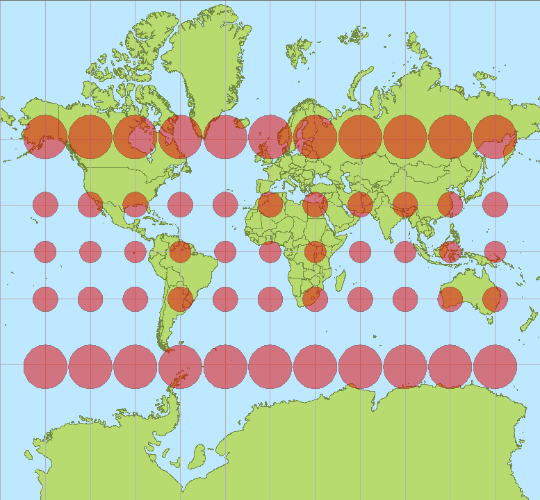
The price is size. To keep angles right, the Mercator map stretches places more and more the further they are from the equator. At 60 degrees north or south, which is about the latitude of Oslo in Norway, everything is stretched to twice its true width and height. That makes areas look four times too big. Near the poles the stretching goes wild, and the poles themselves cannot be shown at all.
In the picture above, every red circle is the same size on a real globe. On the flat map, the ones near the equator stay small, but the ones near the top and bottom balloon out. This is why Greenland looks about as big as Africa on a Mercator map. Greenland covers about 2.2 million square kilometres, and Africa is roughly 14 times bigger. Antarctica turns into a giant slab along the bottom.
Mercator is still very useful. Many online map services use a version called Web Mercator. It works well when you zoom in on a town or street, because small areas are hardly stretched at all.
Australia's true size
Australia is big. Geoscience Australia measures its area at 7,688,287 square kilometres. That makes it the sixth-biggest country in the world, and it covers about five per cent of all the land on Earth.
Look again at Greenland and Australia on a Mercator map. Greenland looks bigger. In real life, Australia is about three and a half times bigger than Greenland. The reason is where they sit. Greenland is far up near the Arctic, where a Mercator map stretches the land to about 16 times its true area. Australia is much closer to the equator, so it is stretched far less. Tasmania, in the south, is stretched a bit more than Cape York in the north.
On many world maps Australia looks smaller than it should compared with the countries in the north. A map that keeps areas true shows how large it really is.
Maps that fix size, and what they give up
An equal-area map keeps the sizes of places in the right proportion, so Africa is drawn about 14 times bigger than Greenland. The trade-off is shape. Equal-area maps distort the shapes of countries, because they cannot also keep angles true. One of the best-known equal-area maps is the Gall–Peters projection. It shows true sizes, but it stretches shapes: sideways near the poles and up and down near the equator. A newer map called Equal Earth, made in 2018, also keeps areas true and looks more natural to many people.
Other maps compromise instead. In the 1990s the National Geographic Society began using the Winkel Tripel projection. It is not equal-area, but it tries to keep all three kinds of error (area, direction and distance) fairly small, so that nothing is too badly wrong. Some maps, called interrupted maps, slice the world into pieces to reduce stretching, leaving gaps in the oceans.
In September 2026 the United Nations General Assembly passed a resolution encouraging wider use of equal-area maps such as Equal Earth, so that places like Africa are shown at their true relative size. It is a request, not a rule, and nobody is told to stop using Mercator. A sailor still needs a map that keeps compass directions straight.
Why is north at the top?
There is no law of nature that says north goes at the top of a map. It is a habit that people agreed on. In 1979 a young Australian named Stuart McArthur published McArthur's Universal Corrective Map of the World, with south at the top and Australia high on the page. He made it to answer the 'Down Under' jokes he had heard. Turning a map upside down does not make it any less accurate. It only changes the point of view.
A flat map is a picture of a round world. It is useful, but never perfect. So when you look at any map, ask two questions. What was this map made for? And what has it stretched or squashed to do that job?
📚 Words to know
- Map projection
- A method for drawing the round Earth on a flat map. Every projection stretches or squashes something.
- Distortion
- When size, shape, distance or direction on a map is stretched or squashed so that it no longer matches the real world.
- Latitude
- How far a place is north or south of the equator, measured in degrees. The equator is 0 degrees.
- Equal-area map
- A map that shows the sizes of places in the right proportion. The cost is that shapes get stretched.
- Navigation
- Finding the way from one place to another, such as steering a ship across an ocean.
🧪 Try this: squash the Earth flat
- You will need an orange or a mandarin, a washable marker, a plate and kid-safe scissors. Draw a rough outline of Australia on the orange's skin, then draw a big circle around it. You are drawing on a ball, just like a globe. Wash your hands afterwards, and do not eat the marked peel.
- Peel the orange carefully in one piece if you can. Do not worry if it breaks. Then press the peel flat on the plate. What happens to your Australia and to the circle? Where does the peel stretch and where does it tear?
- Now cut slits into the edge of the flat peel, so it can spread out a bit like an interrupted map. Is it easier to flatten now? What has been lost in the cuts?
- Compare with a real map. Look at Greenland and Australia on a globe, and then on a Mercator map from an atlas or the Internet. Use a piece of string to measure across each of them. Which looks bigger on the globe, and which looks bigger on the flat map?
- Challenge: look up the Equal Earth map. How do Greenland and Australia look on it? Which parts of the shapes look odd to you?
🧠 Quick check
4 questionsWhere this comes from
We check our facts against trusted sources. Want to find out more? Try these:
- Investigating Map Projections — National Geographic Education
- Selecting a Map Projection — National Geographic Education
- A Whole New World in Boston Public Schools (Mercator and Gall-Peters maps) — National Geographic Education
- Australia's size compared — Geoscience Australia
- Area of Australia: states and territories — Geoscience Australia
- EPSG:3577, GDA94 / Australian Albers (Albers Equal Area) — EPSG Geodetic Parameter Registry
- Greenland geography — Statistics Greenland
- Mercator Projection (Greenland is 16 times larger on a Mercator map than in reality) — World History Commons
- The U.N. backs a new world map showing Africa in its true relative size — NPR (WNYC)
- The Equal Earth Projection: Distortion Characteristics, Adoption, and (Social) Media Impact — International Cartographic Association (Copernicus)
- How the North Ended Up on Top of the Map — History News Network
- Maps tell us stories, not facts — Canada Bay Heritage Society
Keep exploring
 🌏 Space
Why do we have seasons?
It is not about how close Earth is to the Sun. Earth leans over, and that lean swaps summer and winter between north and south. Find out why Christmas is in summer here, why Darwin has only two seasons, and how Aboriginal calendars read the year from the land.
🌏 Space
Why do we have seasons?
It is not about how close Earth is to the Sun. Earth leans over, and that lean swaps summer and winter between north and south. Find out why Christmas is in summer here, why Darwin has only two seasons, and how Aboriginal calendars read the year from the land.
 🏜️ Geography
Why does Australia have so many deserts?
Most of Australia is dry, and it is not just bad luck. A belt of sinking air, a long line of mountains and sheer distance from the sea all play a part.
🏜️ Geography
Why does Australia have so many deserts?
Most of Australia is dry, and it is not just bad luck. A belt of sinking air, a long line of mountains and sheer distance from the sea all play a part.